Design and decor shape how people experience their homes. A well-designed space feels comfortable, functional, and visually appealing. Poor design choices, on the other hand, can make even the largest rooms feel cramped or chaotic.
The good news? Anyone can learn the basics. Whether someone is decorating their first apartment or refreshing a lived-in home, a few core principles make all the difference. This guide covers the essentials, from color selection to furniture placement to those finishing touches that pull everything together.
Table of Contents
ToggleKey Takeaways
- Mastering design and decor fundamentals like balance, proportion, and focal points creates harmony in any room.
- Apply the 60-30-10 color rule to achieve visual interest without overwhelming your space.
- Float furniture away from walls and maintain clear pathways to make rooms feel larger and more functional.
- Layer textures and mix patterns in varying scales to add depth and prevent flat-looking spaces.
- Accessorize with purpose by grouping items in odd numbers, varying heights, and editing ruthlessly to avoid clutter.
Understanding the Fundamentals of Interior Design
Interior design and decor starts with understanding a few key principles. These aren’t arbitrary rules, they’re guidelines that help create harmony in any space.
Balance refers to how visual weight distributes across a room. Symmetrical balance places matching items on either side of a central point. Asymmetrical balance uses different objects with similar visual weight. Both approaches work: the choice depends on the desired mood.
Proportion and scale matter more than most people realize. A massive sectional sofa in a tiny living room overwhelms the space. A delicate side table next to a bulky armchair looks awkward. Furniture should relate proportionally to the room and to each other.
Rhythm creates visual interest through repetition. This might mean repeating a color in different spots, using similar shapes, or establishing a pattern that guides the eye through the space.
Focal points anchor each room. A fireplace, a statement piece of art, or a dramatic window view can serve this purpose. Every room benefits from having one clear focal point that draws attention first.
These fundamentals apply whether someone prefers minimalist design and decor or a maximalist aesthetic. They’re the foundation everything else builds upon.
Choosing a Color Palette That Works
Color transforms spaces more dramatically than any other design and decor element. It affects mood, perceived room size, and overall cohesion.
Start with the 60-30-10 rule. This formula suggests using a dominant color for 60% of the room (walls, large furniture), a secondary color for 30% (curtains, accent chairs, bedding), and an accent color for 10% (decorative objects, artwork, throw pillows). This ratio creates visual interest without chaos.
Warm colors like reds, oranges, and yellows energize spaces. They work well in social areas like living rooms and dining rooms. Cool colors such as blues, greens, and purples create calming atmospheres. Bedrooms and bathrooms often benefit from these tones.
Neutral colors, whites, grays, beiges, and taupes, provide flexibility. They serve as excellent base colors and allow bolder accent choices later.
Consider the room’s natural light when selecting colors. North-facing rooms receive cooler light, so warm tones can counterbalance this. South-facing rooms get warmer light, making cool colors appear more vibrant.
Test paint samples on the actual walls before committing. Colors look different under various lighting conditions and next to existing furniture. A sample that looked perfect at the store might read completely differently at home.
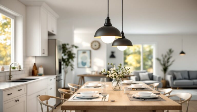
Balancing Furniture and Layout
Furniture placement affects both aesthetics and function. Good design and decor considers how people actually move through and use a space.
Create conversation areas. In living rooms, arrange seating so people can comfortably talk. Sofas and chairs should face each other, typically no more than eight feet apart. This encourages interaction rather than everyone staring at a TV.
Leave adequate pathways. Traffic flow matters. Major walkways need about three feet of clearance. Secondary paths require at least two feet. Cramped pathways make rooms feel smaller and create frustration.
Float furniture when possible. Pushing everything against walls actually makes rooms feel smaller. Pulling furniture away from walls, even by a few inches, creates depth and visual interest.
Anchor with rugs. Area rugs define spaces within larger rooms. The front legs of furniture should sit on the rug at minimum. Ideally, all furniture legs rest on the rug for a cohesive look.
Consider sight lines. What do people see when they enter the room? Position the most attractive elements, a beautiful piece of furniture, artwork, or a plant, to catch attention from the entryway.
Measure twice, buy once. Many design and decor mistakes happen because furniture arrives and doesn’t fit the space. Use painter’s tape on the floor to outline furniture dimensions before purchasing.
Incorporating Textures and Patterns
Texture and pattern add depth to design and decor. Without them, even beautifully colored rooms can feel flat and boring.
Layer textures thoughtfully. Combine smooth surfaces with rough ones. A leather sofa pairs well with a chunky knit throw. A sleek glass table looks great with a woven basket underneath. These contrasts create visual richness.
Natural textures, wood grain, stone, linen, wool, rattan, add warmth. Synthetic and polished materials, glass, metal, lacquer, feel more modern and cool. Most successful designs mix both.
Pattern mixing requires intention. Start by choosing patterns in different scales. A large floral print, a medium geometric, and a small stripe can work together because they don’t compete. Keep them within the same color family for cohesion.
The rule of three applies here: odd numbers of patterns typically look better than even numbers. Three coordinating patterns create interest: four can feel busy.
Balance busy with calm. If walls feature bold wallpaper, keep furniture solid. If an area rug has an intricate pattern, choose solid throw pillows. Every room needs visual rest areas.
Texture works in monochromatic schemes too. An all-white room avoids looking sterile when it includes white linen curtains, a cream wool rug, ivory ceramic vases, and white-washed wood furniture. The variety in texture creates the interest that color would otherwise provide.
Accessorizing With Purpose
Accessories complete design and decor. They add personality and make spaces feel lived-in. But they can also create clutter if used carelessly.
Edit ruthlessly. Display items that hold meaning or visual appeal. Remove things kept out of obligation or habit. Empty space has value, it lets the eye rest and highlights what remains.
Group in odd numbers. Three candlesticks, five books, seven small frames. Odd groupings appear more dynamic than even ones. They force the eye to move rather than settle symmetrically.
Vary heights within groupings. A tall vase, medium plant, and small decorative object create visual movement. Same-height items lined up look like soldiers at attention.
Bring in greenery. Plants add life (literally) to any space. They soften hard lines, add natural texture, and improve air quality. Even those without green thumbs can find low-maintenance options like pothos, snake plants, or high-quality artificial alternatives.
Use books strategically. Books add color, height, and personality. Stack them horizontally as pedestals for smaller objects or arrange them vertically on shelves. Coffee table books invite guests to browse and spark conversation.
Mirrors expand space. A well-placed mirror reflects light and creates the illusion of more square footage. Position mirrors to reflect a view, a light source, or an attractive element in the room.
Accessories should feel intentional, not scattered. Each piece should contribute to the overall design and decor story the room tells.